Challenges
Bright and Patriotic
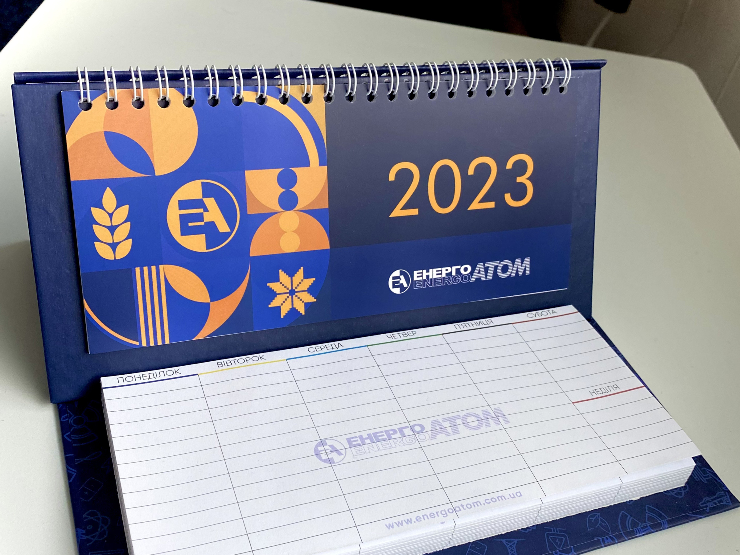
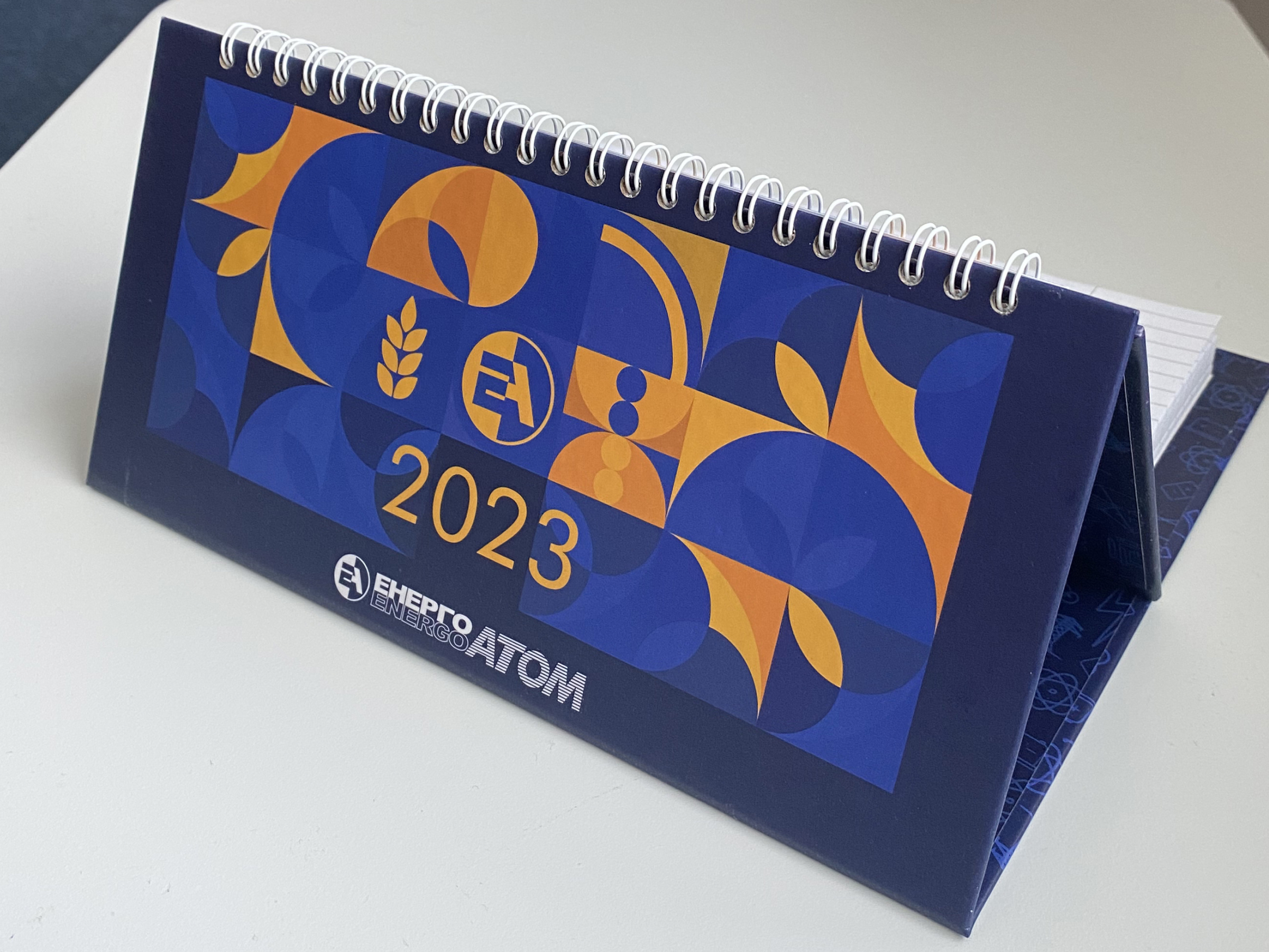
Design a calendar that reflects national colors and symbols, infusing it with a bright and patriotic theme. The goal is to create a calendar that is visually impactful and evokes a sense of pride and optimism.
Versatile Use
Ensure the calendar is both functional and modern, suitable for use as both a wall and desk calendar. It should feature clear, easy-to-read layouts and practical elements that serve daily needs of employees.
Standout Presentation
The calendar should be designed to have a strong visual impact, making it suitable for exhibition purposes. It needs to be eye-catching and innovative, creating a memorable impression that aligns with the executive’s vision of an extraordinary and lively design.

User research
Identifying Readability Challenges
The most significant complaint about previous calendars was the small font size, which made it difficult for many to read, especially for older employees. Additionally, users expressed the need for clearer visibility.
Month Overview
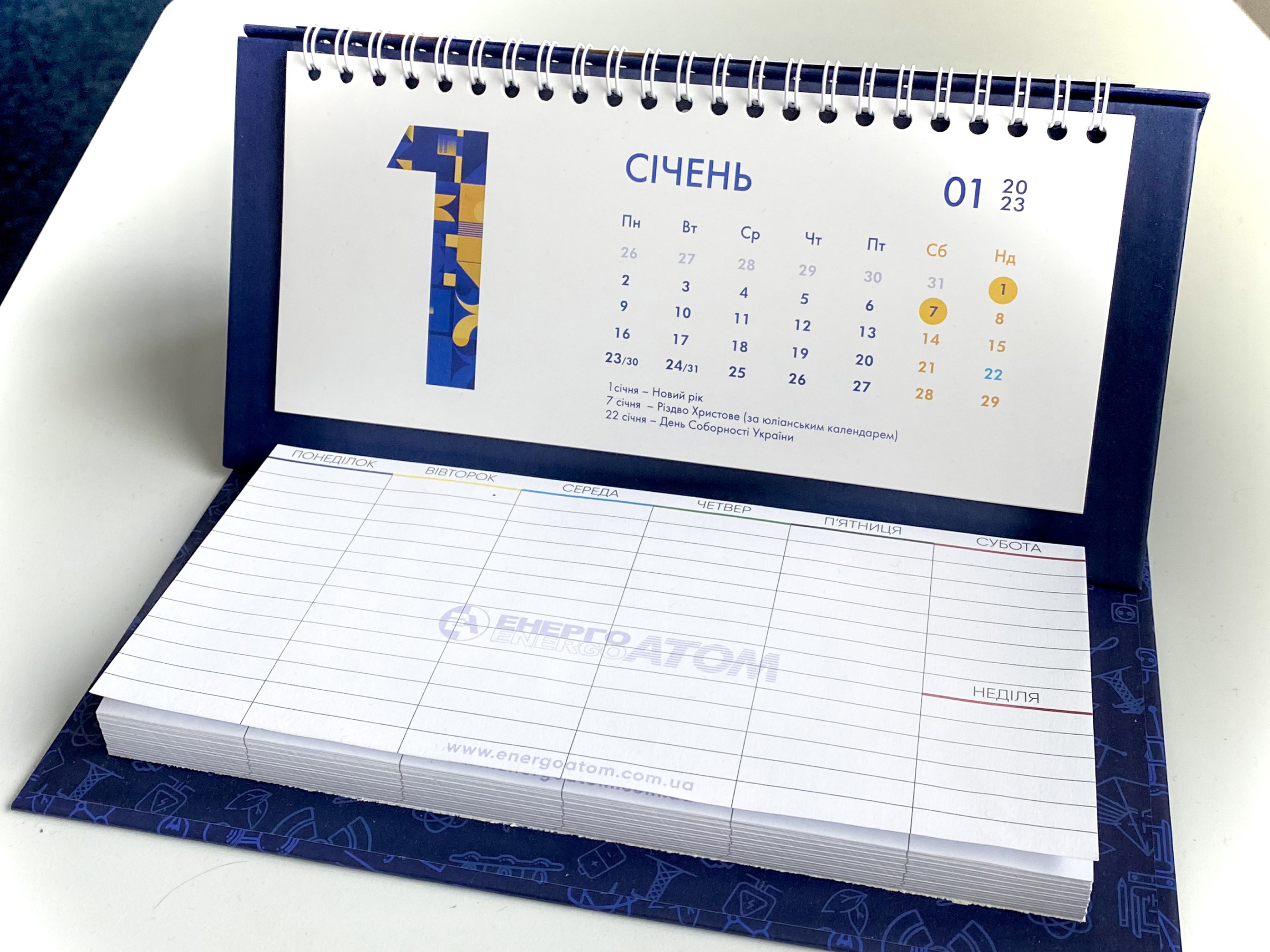
Incorporate both the previous and next months to provide users with a broader perspective and improve convenience. Ensure it includes all weekends and holidays. This feature is important for planning and scheduling purposes.
Durable and Matte
The calendar should be designed to securely attach to walls. Users found it difficult to keep the date slider in place, as it often slid off the current date. The thin paper caused unwanted glare and reduced durability.
Solutions
Functionality for Practical Use
I made the numbers larger, brighter, and more visible with high contrast and an appropriate font.
Additionally, I included the previous and next months on the wall calendar for convenience, especially for accountants who need to plan ahead.
Modern and Patriotic Geometric Design
The design features geometric patterns with subtle national symbols incorporated into a highly contemporary style.
This approach evokes both national pride and a fresh, dynamic aesthetic and suitable for gift purpose.
Carefully Selected Print Material
The wall calendar was made larger to ensure all information is clearly visible, especially for those with vision issues. High-quality, non-glossy paper was chosen to prevent glare. Additionally, I ensured the calendar could be easily hung on the wall and date slider perfectly fits the calendar width.
Conclusion
The calendar received outstanding feedback from the company’s employees, who found it both highly functional and visually appealing.
By incorporating their suggestions, I was able to design a calendar that not only looked beautiful but also met their practical needs, with larger, clearer numbers and a user-friendly layout. The result was a product that people truly enjoyed using.


